Today, we are pleased to share with you Eco-Counter’s fresh new look! One year in the making, our new website, branding and logo aim to improve your experience working with us and better reflect who we are as a company – an innovative, friendly and supportive small-business who cares deeply about your projects and your goals.

So, what’s changed?
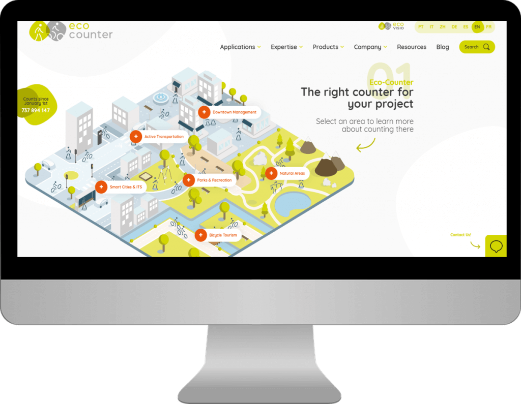
First and foremost, our website has been entirely re-designed in order to improve visitor experience. The new site makes it easier for you to find the right solution for your need. The site is more lightweight, interactive and overall much easier to navigate. This means that any visitor to the site will more effectively find the information they need – from an engineer looking to get the IP waterproof rating of the CITIX-IR, to an advocate reading for the first time about the power of count data.
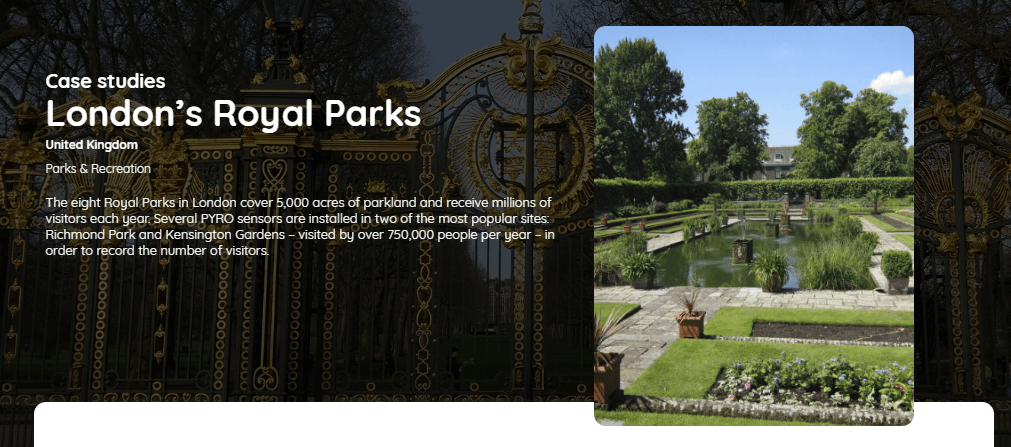
The site also has a whole new section – titled ‘Resources’ – which aims to share stories of organizations we proudly work with around the world. Here, you will find a wide variety of case studies that highlight how counters and count data are used to take projects one step further. From developing a bike count program in Quebec City, to using count data for reindeer conservation in Northern Norway, there’s a lot to learn there. It’s my favorite part of the new website and I think you’re going to really enjoy it.
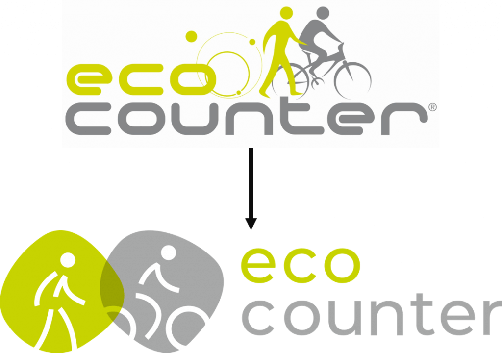
Our logo has also been given a facelift! It’s subtle – the colors and principle themes remain the same – but our font and icons used have been streamlined to reflect simplicity and modernity.
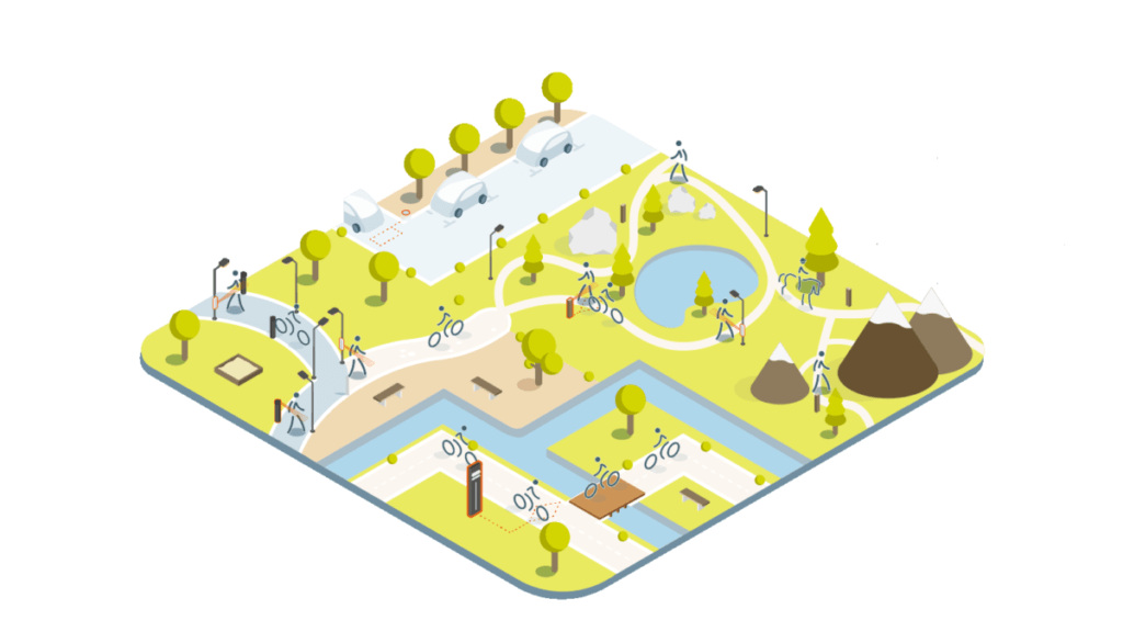
We’re also changing the way we present our products, as you can see in the graphic below. Once again, the imagery aims to be inspirational, instilling ideas for all of the places that counters can be installed.
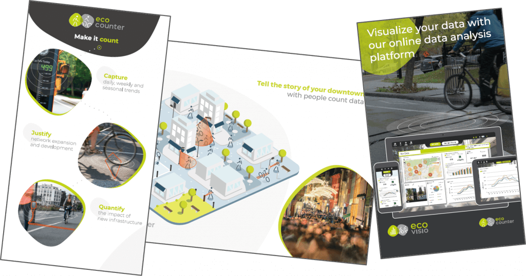
If you see us at conferences or catch us in person at meetings, you will also notice that our branding update has fed into a total rework of our promotional material, including conference banners, case studies, postcards and brochures. Once again, the new material is clearer, more informative and gets straight to the point of what solution we address for you.
Among all these changes, what’s remained the same is us as a company and our dedication to finding data solutions for your project – this update aims to reflect just that.
We hope you enjoy our new look and, as always, are here to talk if you have any feedback.


There is no comments